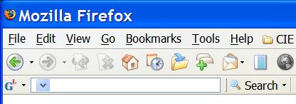
Beginning with Googlebar Lite 4.0, an interesting problem has cropped up with the search history edit box. Take a look at this screenshot sent in by a Googlebar Lite user:

See how the drop-down marker is all the way to the left of the search box? The actual edit control has been resized to 0, while the popup element (which should be invisible) has been resized. I can get this problem to occur on demand using the Charamel theme. What's most frustrating is that I cannot make it go away. I've tried forcing the edit control's style via CSS, but the rules get ignored. I've built a bare bones toolbar from scratch to try to isolate the problem, to no avail. This is apparently a problem with the autocomplete textbox itself. A Firefox bug? Perhaps. If you happen to run into this problem, there are three courses of action you can take, none of which are very appealing:
- Use the default theme (if you already aren't). I have yet to see this using the default theme, although my dad has run into it using the default (he uses large fonts in Windows, however, so that might be the difference).
- Disable search history.
- Use Googlebar Lite 3.3.
Again, none of these solutions are ideal.
Do you know what's going on here? Know of an existing bug in Bugzilla that references a similar problem? Found a workaround or a fix? Please let me know! I will continue to investigate this issue, but I don't see a fix at this time. If only everything would just work as it is intended to …